As a part of design team of major events MindBend & Sparsh in my institution
NIT Surat I've designed following posters & a logo.
This is one of my favorites because the only GIMP tool used is Pen Tool. Rest effects were given by Gradient & Shadow features
 |
| Logo for annual cultural fest SPARSH: Theme 'Superheroes' |
Following poster also illustrates the same stuff as above.
 |
| Coming Soon Poster based on above logo |
This one was the first poster I ever made.. & I love it. See the slanted 1010101 & other text in background.. I literally wrote it down in MS Word. Took a screenshot & then utilized them here. Ankit Fadia's pic is copied from his website :p
 |
| Official Poster for MindBend 2012 Workshop |
|
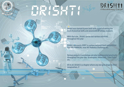
Introductory poster for technical student chapter DRISHTI of NIT Surat. It looks a bit complex coz I
merged a lot of images which is not considered good as valuable
designer. So I don't like this one, however just posted all of it, the
good, bad & ugly :)
 |
| Introductory Poster for Technical Student Chapter DRISHTI |
Workshop on Touchscreen & similar stuff. Idea was to reflect the
touch-pad look & did so successfully by background that has squares
of different sizes resembling touch screens.. Overall makes a
touchy-geeky look.
 |
| Official Poster for Touchscreen Workshop in MindBend 2012 |
Treasure Hunt Poster. This was one of the most time consuming poster. You see the path in background? I actually drew it using brush by following
our college map. And extra foot-steps and dotted lines are just for decorative purpose. Those coffee-stain effects were given using custom scripts. Had to use Blur tool for creating the canvas behind the background.
 |
| Treasure Hunt Poster |
LAN Gaming Poster, this was done in quickest amount of time, I just had to think as a gamer to design this one and I'm myself an addictive gamer :-p. So this was pretty easy for me to design and you can see how effectively gaming theme was implemented. Of-course images of several game posters were used and were resized to thumbnail-size images with frames around them.
Singing Night Poster: In the beginning I made it quite busy. Too many colors and all but then struck the idea of rendering the feel of a stage by simple black human figures. It worked out well and after some spot-light effect the poster was ready to be printed!
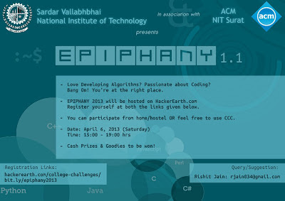
Coding Competition Poster: To be honest I'd mention that following was not liked by a few of the organizers, but still I'm putting it here because I like the color combination and the way how it described the event both with respect to background and font selection.
 |
| Coding Contest Poster |
Another one for the same event, everyone liked it but me. Because one of the strength of any poster is its background and I admit that the background here was not developed by me. Still its not over. I had to make background represent a coding contest which I tried to imply using a watermark text of names of programming languages.
Next comes the name "EPIPHANY", special care was taken to decide how its represented. Challenge was to merge it with the
falling lines in background. First used suitable font, then used White-Grey gradient over the text "EPIPHANY" and then drop-shadow effects, both inner and outer. Voila!! Its done. Some more zoom-in editing and it was merged perfectly well with background.
Posters & Logo by
Ravi Ojha


